


Visualising Black Friday
We have all been exposed with excitement and concern to the challenges and opportunities that Sale campaigns pose to our stores and apps.
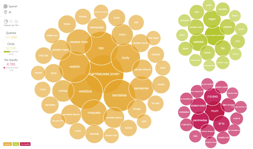
Sourced from these challenges and within the context of Search inside the store or the app (known as Site Search or on-site Search), I have always been curious on the possible ways in which the Demand and Intentions of the People are articulated, how these queries, these words that express needs and desires are formulated, what gaps are there, what things are common and how this expression of intentions, can be maximised so the store reacts empathetically f.or the interest of loyalty.
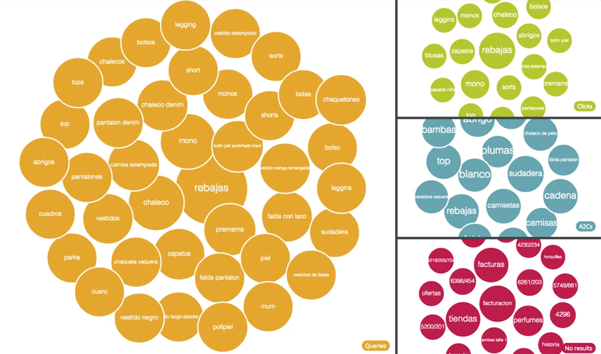
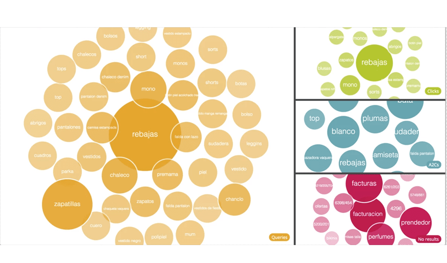
At Empathy we process tens of millions of queries every day in over 30 languages, an awesome source to experiment with Data Visualisations and yet a massive computational challenge. Using the StatsAPI from the EmpathyAPI services we set out to create a Live Stream of the incoming queries, reflecting their Success in terms of No-Click, Click or No-Results.
Using d3.js and with the extraordinary talent of various key members of the Empathy.co family like Manuel Fachal (on the early versions) and then the super-hero Cristian Casais we have been able to produce a pretty decent and effective experiment that is able to present query clusters by demand in Real-Time, exhibiting the language of the People and the success of these terms with a continuous sense of a living pulse.
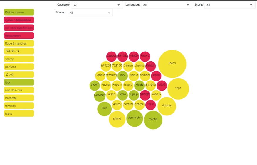
The first version of Black-Friday Real-Time Visualisation of Demand
- Provide a fast picture of what's happening
- Help to understand how Search is performing
- Identify proactively and react early to opportunities, behaviors and trends
- Show patterns and relationships between types of events
- Maximize profit through constant adaptation and usage of our dashboard actions (data-driven decisions)
- The more recent, the more value
Result
Issues we set out to improve from this original version:
- Lineal data, it only represents events since the visualisation is open
- Sample depends on random factors (displayed data can be totally different after reloading)
- Sample is not representative, there are a lot of events with only 1 occurrence
- It does not keep an up to date status, after a certain time it "explodes", losing prior data
- Ball size depends just on quantity
- It uses D3.js v3
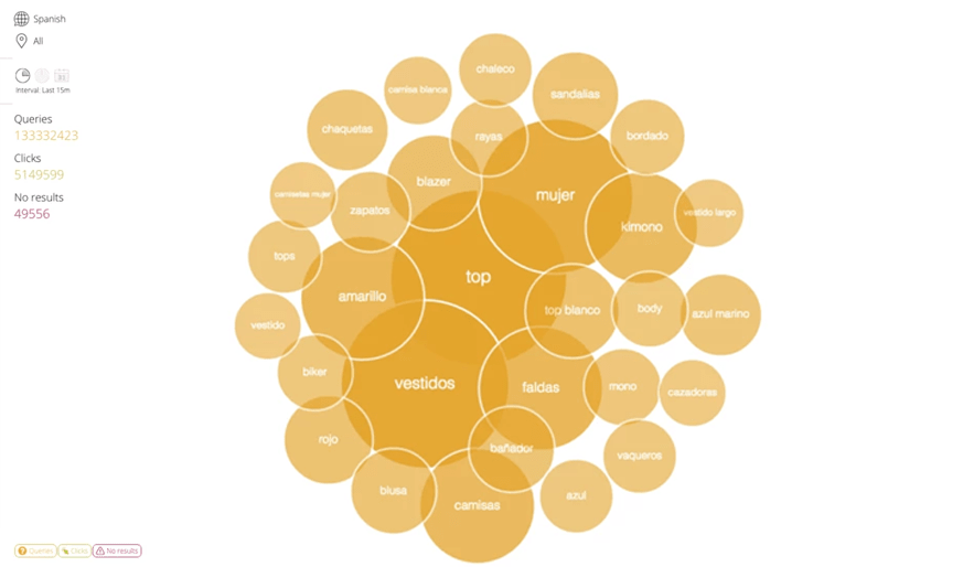
Why we need a new Black-Friday Real-Time Visualisation?
- A more stable, representative and coherent sample
- New Ranking model that also takes into account time
- Evolve current look and feel
- Upgrade to D3.js v4, which provides improved performance and syntax
Approaches
Hope you love this experiment as much as we do! Stay tuned as we continue to evolve these concepts that are already today projecting on the walls of top retailers (wink)
