


d3 tips from a d3 noobie
We live in a world suffused with data: From online shopping to our Netflix viewing history, information about ourselves and other people arounds us is always being collected. But, is that information truly helpful when it’s only numbers on a paper?
I’ve always loved data visualisation. I remember scrolling through my Twitter feed and coming across all these beautiful drawings… Not only were they stunning to the eye, but they provided value and knowledge to the viewer. I used to check that account everyday and wonder if, one day, I would be able to do something similar. Now, I do.
Being at Empathy Academy has allowed me to slowly begin working with D3 and, although I’m still learning every day, throughout my journey I’ve collected a few tips that I would like to share with any future vizers who may be reading.
1. Keep it simple:
Sometimes we want to show so much information, and we want to make our viz so cool, that it becomes quite messy. And the concept we wanted to get across becomes fuzzy and unclear. Therefore, you should remove from your viz everything that does not provide any value and keep only the truly important elements. Statistician Edward Tufte uses the term “data-ink ratio” to calculate the percentage of essential information shown on the visualisation. What you want to do is keep this ratio the highest that you can. Sure, those pink flowers around your graph may look cute, but if they don’t provide any value you should probably get rid of them.
2. Make it interactive:
A visualisation’s final purpose is to give the viewers knowledge, so you must keep them engaged with what you are trying to show them. That’s why it is always a good idea to make your data interactive. By allowing the users to click and drag things around the screen, you will keep them focused and curious to know more. Another good idea is to use multimedia elements. If you have a music visualisation, why not give the user the option to listen to those songs? Or maybe you could animate the drawings on the screen!
- Sketch it up
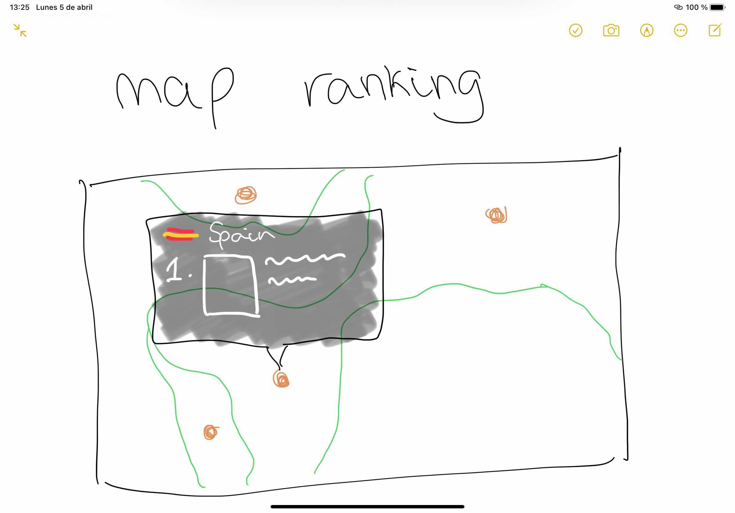
One great thing to do before you start coding is to always draw a sketch. You can draw it by hand, and it doesn’t need to be too detailed. By drawing and preparing your visualisation in advance, you will be able to make changes more easily, and you’ll have a clearer view of the project once you start writing in D3. Trust me, I’m a very bad drawer, so if I can do it, so can you!
4. Open your mind
Sometimes, once we think of one visualisation for a specific set of data, it is hard to come up with something new for the same information. Try to force yourself into thinking of more than one prototype. Then choose your favorite one; the first idea may not always be the best! Also, two different visualisations of the same data may provide contrasting viewpoints on the topic. Allow your viewers to watch and choose between those different perspectives by providing them with both.
5. Be inspired
Personally, the hardest part about data viz for me is creativity. Don’t be afraid to draw inspiration from your colleagues or from the internet, find some online blogs that motivate you, and create your very own mood board filled with future project ideas. Also, keep all your past sketches and failed projects; you never know when they might come in handy!
Sometimes you will feel like you are not doing your best and your visualisations may not be as cool as you would like. Just keep pushing. I believe the beauty of DataViz to be that you can create basically anything you set your mind to.
So, keep visualizing, the sky is the limit!
