


Searching for Seasonal Keywords within the Data Forest
At Empathy.co one of the challenges we’ve taken on is to develop Data visualisation into one of our crown jewels. We’ve invested a lot of time and resource in this area and one visualisation that’s been particularly interesting is that of keywords. In fact, we started working on this due to a huge customer demand and a desire to understand the use of site search queries and terms.
Experience has taught us how to interpret the world of online search queries and all the relevant information surrounding them, such as for example, time, trends and user’s behaviour. Inevitably, this means we need to go deeper and deeper into the immensity of the terms and the whys, it´s a bit like exploring a forest and examining each tree, branch and leaf.

As a result, we’ve developed a Seasonal Keywords Trends tool which, through careful data cleansing, is able to produce various graphs that highlight important data patterns for our customers.

The wood for the trees
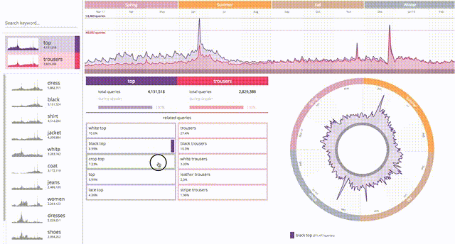
Within our leafy forest of queries and terms, sometimes it can be hard to see the wood for the trees. However, analyzing and visualizing each keyword, in terms of time and frequency, can provide a deep understanding of each specific word, also revealing its seasonal behaviour.
It’s also possible to make comparisons between two different terms, and decide the right moment to introduce a particular product into the market through understanding previous keyword behaviour and past usage.
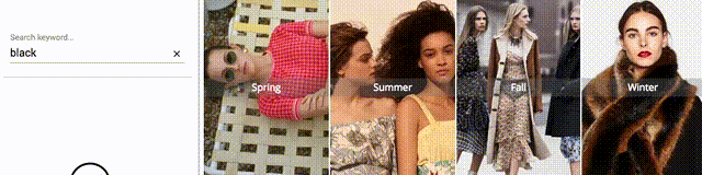
For example, black is well-known as a winter colour and the following seasonality visualisation demonstrates this.
The ‘Komorebi’
Going deeper into our leafy forest, the following Seasonal Keywords Trends diagrams go a step further into the detail. Having seen how we can decipher the wood for the trees, so to speak, here we can go beyond the physical dimensions of the forest, we can analyse the effect of the sunlight on the leaves, how they reach up and capture each stream of sunlight. The Japanese refer to this as ‘Komorebi’ - the effect of sunlight streaming through the leaves of the trees.
We can analyze and visualize each stream by playing with keywords, finding out if the relationship between two terms is loving or hostile, and identifying when this relationship works best. For the customer, this means having valuable, accurate and real-time information at their fingertips and being able to convert this intelligence into actions to make informed market and catalogue decisions.
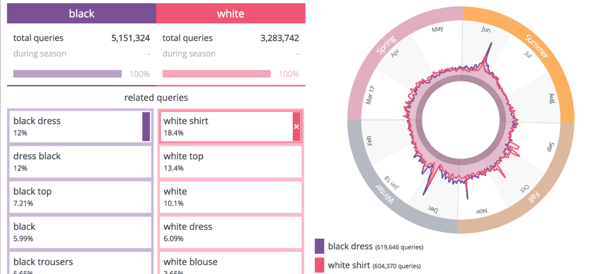
Going back, for a moment, to the concept of the colour, in the next visualisation we’re able to understand with more detail which are the top intentions around two colours, for example black and white. In the below case “dress” and “skirt” are the partnering terms for each colour and, as we can see there is no specific seasonality for these two “queries”, they overlap almost consistently throughout the year.
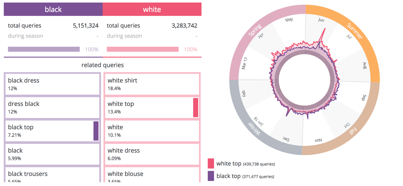
However, if, for example, “white top” is a seasonal query, a summer query, we can see below that the queries increase with the warmer weather. Understanding this could really help online retailers to make decision in terms of both designs and stock.
Above the trees
Understanding the behaviour of searched terms within a site is critical for eCommerce retailers. It allows them to have a bird´s eye view of the forest and be able to anticipate market trends through a solid understanding of their products, catalogue and demand.
Our clients have a real desire and eagerness to learn and understand each term and query from a precise and detailed perspective. That’s why we created our Seasonal Keyword Trends tool offering visualisations that bring brightness and clarity to the forest of queries and terms while also generating valuable and actionable insights.
